Fragmented work tracking
Tasks lived across chat, spreadsheets, and ad hoc lists, so priorities were unclear and handoffs broke down under load.

Case Study · Productivity · SaaS · 2024
A task management platform that unifies boards, team workflows, interaction states, and third-party systems in one cohesive product experience.
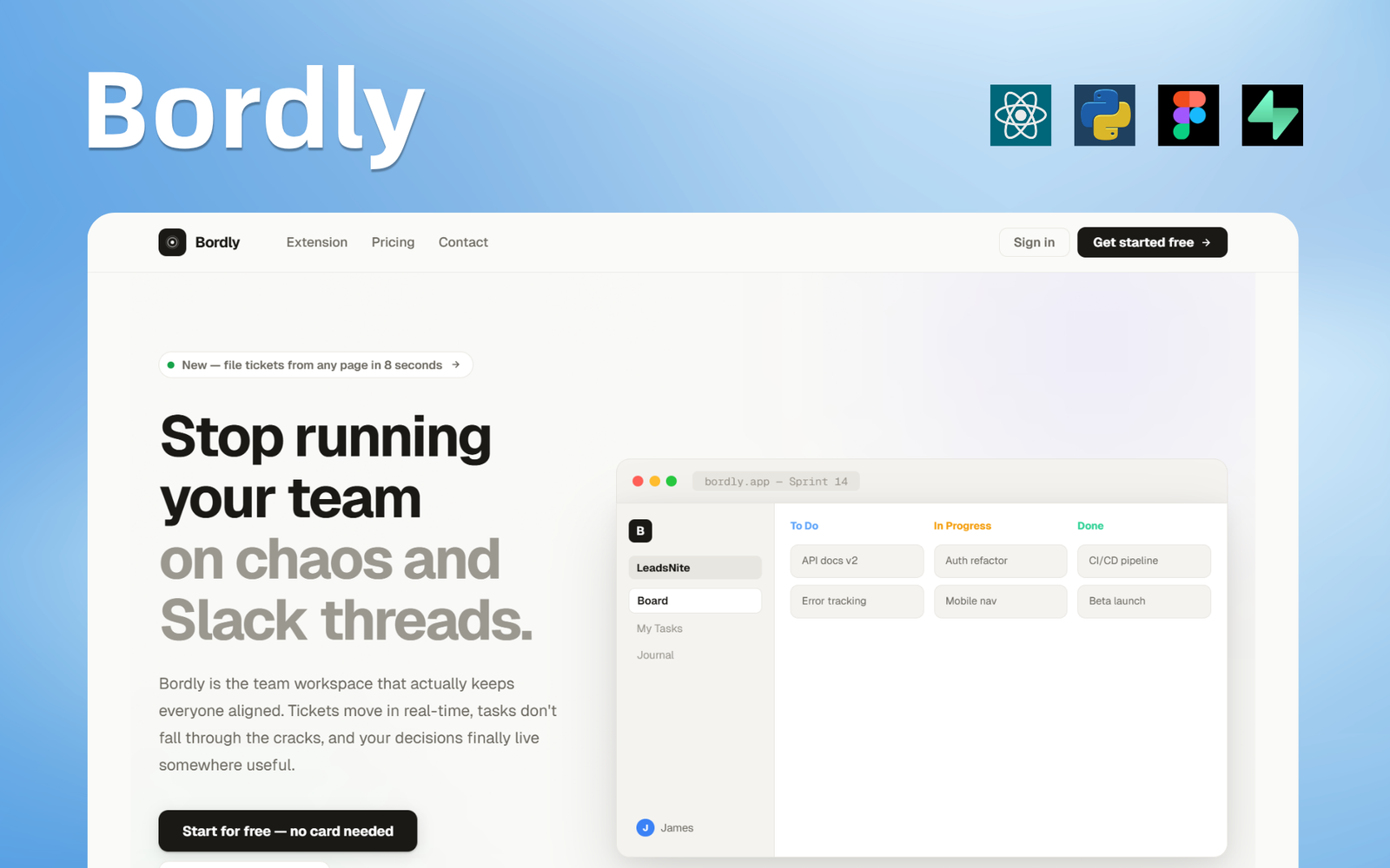
Teams needed a single place to plan work, track ownership, and adapt as priorities shifted. We partnered to shape a task management experience that stays fast at scale:from quick captures to deep board workflows.
The platform emphasizes clarity: consistent interaction patterns across views, dependable real-time updates, and hooks for the tools teams already use, so managers and contributors spend less time coordinating and more time shipping.
We had a rough idea and honestly didn't know how to structure it. Their team stepped in, asked the right questions, and just made it work. The final product feels fast and really easy to use.
The problems we uncovered and exactly how we solved them.
Tasks lived across chat, spreadsheets, and ad hoc lists, so priorities were unclear and handoffs broke down under load.
A shared structure for items, columns, and ownership with seven-plus interaction states so every transition is explicit and recoverable.
Existing tools forced one workflow; teams needed multiple board systems and states without sacrificing consistency.
Multiple board templates and layouts that teams can mix, backed by performant lists and filters for large backlogs.
Connecting calendars, notifications, and third-party apps required a clear API surface and predictable state handlers.
Webhooks, REST endpoints, and extension points for third-party systems with consistent error handling and retries.
Power users wanted depth while casual users needed zero onboarding friction:both had to coexist in the same interface.
Simple defaults for new users with advanced shortcuts and bulk actions for leads:tested across real team sizes and workflows.
Screens from across the platform experience
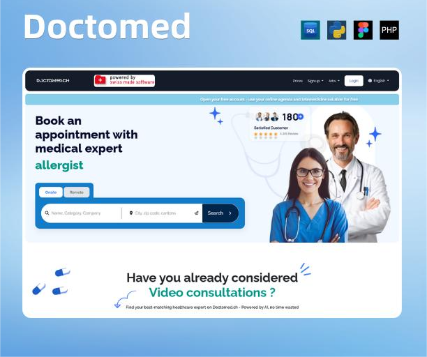
Telemedicine and appointment booking for Switzerland:patients and clinicians, 24/7.
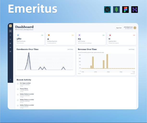
Expert teaching, workshops, and a seamless digital path to course enrollment for students and tutors.
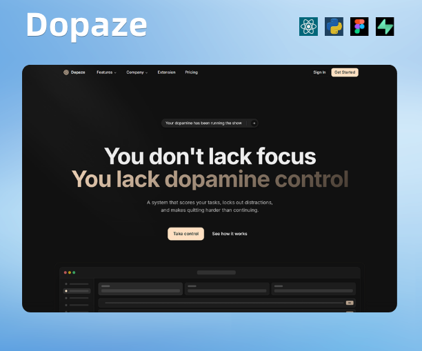
Structured web platform with clear workflows, scalable architecture, and reliable delivery.